3. Question 3
Visit the St. Clair College website. Analyze it strictly from a visual marketing strategy perspective targeting:
Local domestic high school students. You are to provide three strategic visual enhancement recommendations. For each recommendation:
a) Clearly identify the issue or missed opportunity (3 x 2 = 6 Marks)
b) Propose a specific visual improvement (3 x 2 = 6 Marks)
c) Explain why it would improve recruitment effectiveness (3 x 2 = 6 Marks)
d) Connect it to student psychology and digital behaviour (3 x 2 = 6 Marks)
St.Clair Homepage Splashboard
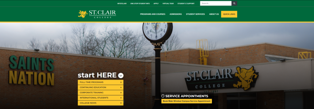
St.Clair used a picture of their Chatham campus as their main feature on their home page. The Chatham campus is an older campus and isn’t as visually impressive as the others. To a local highschool student I may not even know St.Clair had multiple campuses and this image would be my first impression. The Chatham campus looks like a high school compared to the main and windsor campuses
I would change the image to either show the new additions to the main campus or the main downtown campus. The main campus additions are fairly new and impressive, The building looks very new and modern. The Windsor campus also comes off as more impressive because of its location and size. The building is on the waterfront of Windsor overlooking Detroit and stands hundreds of feet tall. Either of these images would give the local high school student a far more compelling and interesting reason to engage with the st.calir website by making them excited about possibly going there.
These changes would improve recruitment effectiveness because the content of the images is more engaging. You’re displaying something people can actually get excited about. To a highschool student the Chatham campus looks like another highschool and im sure that the last place they want to go back too.
St.Clair Homepage Program Availability
St.Clair displays their programs in one long list that users can scroll up and down on with no organisation of category. Displayed next to each program is a small dot explaining whether the program is open, closed or waitlisted. The problem with this system is that the dots are really small on the page and in order to use the page you must scroll it. But when you scroll all the dots merge into one colour because they’re in a sequential list. This makes the already annoying to navigate list even harder to understand.
The solution to this problem would be either to enlarge the icons or attach the colour to the font of the text. In its current format it is small and not clearly displayed. Another fix for this page would be to separate programs into categories to make it easier to find programs than one long list.
Local high school students are used to the world of social media where scrolling is constant and no time is spent on posts they don’t like. IF this behaviour translates to the web this page could become incomprehensible to a quick paced highschool aged brain. In order to scan the page you need to scroll but when you scroll it obscures the program’s availability. Making this page easier to navigate would greatly benefit recruitment. This page is directly tied to people choosing programs and deciding if they want to go to St.Clair or not. Making it easier to navigate would only benefit them and the people using the page.
St.Clair Virtual Tour Video
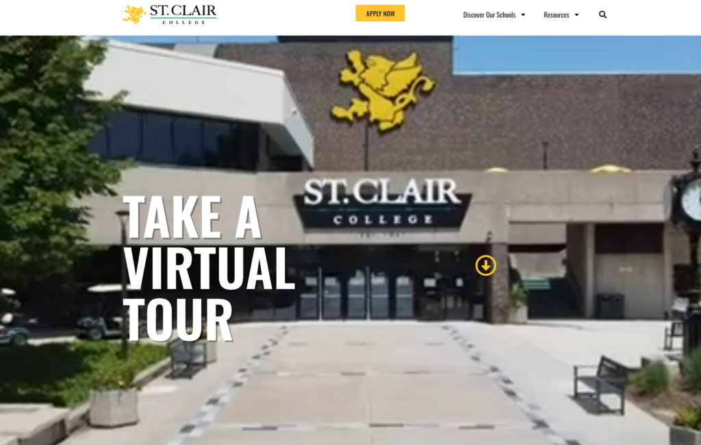
When you open the St.Clair virtual tour page a video immediately pops up showing drone footage of all the St.Clair properties. The problem with the video is that it is clearly a low resolution, the image is visibly blocky and blurry. I have wired the ethernet at 100gp up and down, reloaded the page several times in different browsers and on vpn and each time it played the same blurry video. THeres even a point on the video where it seems to jump in resolution randomly then drop abc down again. These instances happened at the same time in each replay and didn’t seem to be related to my wifi connection.
The solution to this is either to remaster the video so it’s at an acceptable resolution for modern content or remove it completely. The poor image quality especially on a professional education website will be shellshock to a local highschooler. They have grown up in the age of on demand video streaming and 1080p content being the standard. Blurry and low resolution content will be an immediate red flag to them. The poor quality will take away the context and meaningfulness of the image making it useless.
Because the video is displayed so prominently St.Clair is making it part of their recruitment process. In its current form it’s a kink in the system and not conveying what it reads too. Instead of showing off impressive shots, the poor quality undermines the true purpose of the visual content.